Styling our React App – Module.css and Styled components
In this post we are going to study two different approaches to using styles in our applications. The two options that we present in this blog are “module.css” and “styled components”. We are not going to discuss having CSS global. At the end of the post, we are going to have a conclusion about the two CSS approaches.
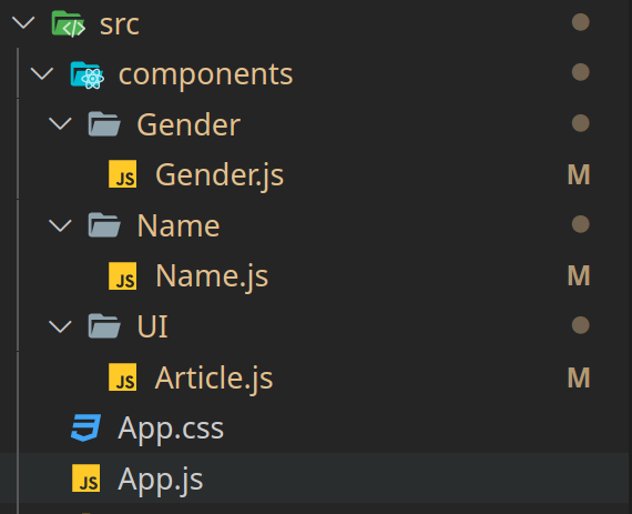
The application is very simple, and we anticipate it to look like this:

We will only use three components in this app: ‘UI/Article.js,’ ‘Name/Name.js,’ and ‘Gender/Gender.js.’
The code will be available in the next release.
https://github.com/sierra-oe/Redux-ReactJS-Http-Request/releases/tag/v1.1
1. module.CSS with react
This method allows you to create CSS files that will be applied only to the components into which you import them; the magic happens because when you build the project, it hashes the name in order to avoid repetition and overriting styles. It is critical to avoid bugs caused by the combination of component styles.
This approach is also too similar when writing HTML and CSS code, because you use classes to identify the elements you require.
If you configured your project step by step, you must follow the ‘Installing dependencies’ section; otherwise, you can skip ahead to ‘1.2 Implementing module.css’.
1.1 Installing dependencies
You don’t need to install anything if you create your project with npx create react app. However, if you create your project step by step, as shown in the following link http://moroquin.shekalug.org/creating-a-reactjs-project-step-by-step/ , you will need to install:
npm install css-loader style-loader --save-devNow we need to add the rule to our webpack.config.js to tell them how to treat the CSS files that we use in our components.
{
    test: /\.css$/i,
    use: ['style-loader', 'css-loader'],
}
If you followed the previous post about creating a react app from scratch, your webpack.config.js file should look something like this.
const HtmlWebpackPlugin = require('html-webpack-plugin')

module.exports = {
    mode: 'development',
    output: {
        filename: 'app.bundle.js'
    },
    plugins: [
        new HtmlWebpackPlugin({
            template: 'src/index.html'
        })
    ],
    module: {
        rules: [
            { test: /\.js$/, exclude: /node_modules/, use: { loader: 'babel-loader', options: { presets: ['@babel/preset-env', '@babel/preset-react'] } } },
            {
                test: /\.css$/i,
                use: ['style-loader', 'css-loader'],
            }
        ]
    }
}
1.2 Implementing module.css
It is important to note that for combention, the css files should be named ‘ComponentName.module.css’ with the’module’ appended to the name, Our CSS should look like this
.main {
    margin: 0.5rem;
    padding: 0.5rem;
    border-radius: 0.5rem;
    width: 40%;
    background-color: rgb(212, 212, 205);
    text-align: center;
    display: inline-block;
}
So in our component we are going to import
import classes from './Article.module.css'Now we can use the class styles in our react component, as shown in the following code.
<article className={`${classes.main} ${props.className? props.className:''}`} >
    {props.children}
</article>
Our CSS class should look something like this:
import React from 'react'
import classes from './Article.module.css'

export const Article = (props) => {
    return (
        <article className={`${classes.main} ${props.className? props.className:''}`} >
            {props.children}
        </article>
    )
}
1.3 Some conclutions about module.css
Now we can build the application to inspect the output a little more closely, which you can do by running:
npm run buildNow that we have a new folder called ‘/build,’ we can search for the minimal CSS that should be in the ‘build/static/css’ folder,
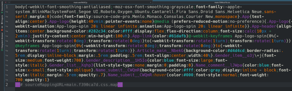
The image shows
- All of the class names are hashed, and there are no issues with overriding styles in the code.
- The minified CSS file is optimal because it contains only the necessary white spaces, resulting in a small file size.
2. Styled Components
Styled components enable the creation of React components with CSS styling. The styled components are intended to assist developers with:
- Creating unique class names for the styles we use is essentially the same as creating a component that we can use. Reduces the number of bugs caused by the use of class names.
- Simplified the maintenance of the styling code, making it easier to change or delete CSS.
- Automatically manage code splitting, resulting in a better user experience when our application is loaded.
- This method ensures that you will not have problems with CSS collitions if you define different styles in different components.
Styled Components requires the installation of the following packages.
npm install styled-components --saveIt is critical to appoint this package is a production dependency. In the following example,
In this case, we’ll be utilizing the Name.js component. This component should appear as follows:
import React from 'react'
import { Article } from '../UI/Article'
import {Comment, Submit} from './styles'

export const Name = () => {
    return (
        <Article >
            <h2>NAME</h2>
            <Comment >Insert the name to verify the gender</Comment>
            <form>
                <label htmlFor='gname'></label>
                <input type='text' id='gname' name='gname'></input>
                <Submit type='submit' value='check' />
            </form>
        </Article>
    )
}
And our styled component should appear as follows:
import styledComponents from 'styled-components'

export const Comment = styledComponents.p`
    font-style: oblique;
    font-size: x-small;
    color: blue;
`

export const Submit = styledComponents.input`
    display: inline - block;
    margin: 0.5rem;
    color: gray;
    opacity: 0.7;
    font-style: italic;
    background - color: rgb(255, 255, 255);
    &:hover {
        opacity: 1;
        color: black;
        font-weight: bold;
        font-style: normal;
    }
`
2.1 Conclusion about Styled components
If we create the project’s run build with
npm run buildIt is important to note that the css style is no longer used in the styled components, so the css style is included in the javascript file. We can see the’main.js’ file and examine it.

Pay attention to the ‘n’ symbols now. It has all of the indentation that we used previously. And keep in mind that when we build something, we expect the output files to be optimized and minimal.
The advantages of this approach could be as follows:
- We use styled-components to create new components, which we then use in our custom components.
- Our components, on the other hand, are easier to read and maintain.
- The files are not optimized because they contain white spaces and symbols that are not required by the file.
3. module.css versus Styled components
To draw some conclusions, I constructed the project with styled components and module CSS, and the result was
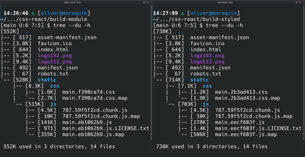
The left image shows’module.css,’ while the right image shows’styled components.’
It is important to note that when I create the project with the ‘npx create-react-app’ command, it generates a css global file that I do not delete. That is why the styled component project includes a css minimal file.
My current point of view is
- When comparing Javascript files, the’module.css’ is smaller, despite the fact that the’styled components’ is slower to load.
- The styles in’modules.css’ are optimized and minimal. The styles from the’styled components’ included in the main javascript are not optimized or minimal. As a result, the page loads slower with’styled components’ than with’module.css’.
- In comparison to’module.css,”styled.components’ is easier to maintain and prevents bugs due to the names of the classes.
As a result, I preferred to use’module.css’. It would be great if you could comment on which approach you prefer and why.


Leave a Reply